
Introduction: The Website Sales Trap (And How to Escape It)
Are you thinking about how to build a website that sells without feeling salesy? Ever landed on a website that practically shouted at you to BUY NOW? Yes, we too. And guess what? You probably left.
That’s because the best websites don’t scream — they guide. If you’re trying to sell a product, service, or even an idea, your site should build trust, not tension.
At Pixcelfy, we believe websites should sell without being salesy. Here are top 10 ideas that will help you to know how to build a website that sells and along with it even earns love, loyalty, and conversions — without ever feeling pushy.
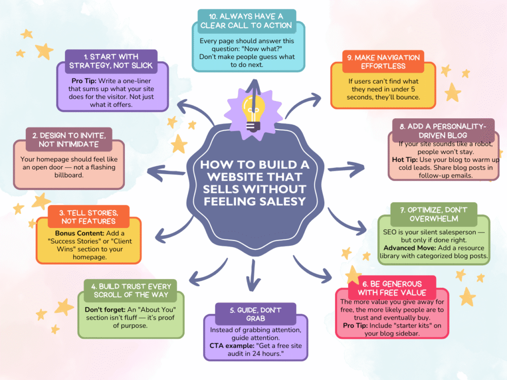
1. Start With Strategy, Not Slick
Before you even think about how to build a website that sells, think about color palettes or CTAs, and ask yourself:
- Who is this website for?
- What do they need most?
- How will my site solve their problem better than anyone else?
👉 Pro Tip: Write a one-liner that sums up what your site does for the visitor. Not just what it offers.
“At Pixcelfy, we build websites that speak human — and sell naturally.”
2. Design to Invite, Not Intimidate
Your homepage should feel like an open door — not a flashing billboard.
Keep it:
- Clean (whitespace is your friend)
- Conversational (ditch the jargon)
- Purpose-driven (one call to action per section is enough)
Great examples of how to build a website that sells regarding inviting design:
- Headline that speaks to a pain point: “Finally, a website that works while you sleep.”
- Warm, real photography (bonus: human faces build trust)
- Subtle animations that draw attention without screaming
3. Tell Stories, Not Features
Facts tell. Stories sell.
Instead of saying: “We offer SEO services,” say:
“After working with us, Priya’s photography site climbed from page 7 to the first result on Google — in 2 months.”
Let your testimonials, case studies, and real results do the heavy lifting.
📦 Bonus Content: Add a “Success Stories” or “Client Wins” section to your homepage.
4. Build Trust Every Scroll of the Way
If you’re wondering how to build a website that sells, this is it.
Trust is the currency of the internet. Here’s how to earn it:
- Use real testimonials (with faces + first names)
- Show recognizable logos of past clients or partners
- Add badges (certifications, awards, “secure checkout”)
- Include detailed FAQs (objections are silent deal-breakers)
📌 Don’t forget: An “About You” section isn’t fluff — it’s proof of purpose.
5. Guide, Don’t Grab
Instead of grabbing attention, guide attention.
When you are on a journey on the thought of how to build a website that sells.
Structure every page with a journey in mind:
- Problem/pain point
- Your unique solution
- Why you’re qualified
- Clear next step (CTA)
🎯 CTA example: “Get a free site audit in 24 hours.”
6. Be Generous With Free Value
The more value you give away for free, the more likely people are to trust and eventually buy.
This is the most valued point when you are thinking about how to build a website that sells.
Ways to give value without selling:
- Free website checklists (like the one on www.pixcelfy.com)
- In-depth blog tutorials
- Downloadable templates (guides, planners, branding kits)
💬 Pro Tip: Include “starter kits” on your blog sidebar.
7. Optimize, Don’t Overwhelm
SEO is your silent salesperson — but only if done right.
- Use your focus keyword (“how to build a website that sells”) naturally in your headings and throughout the copy
- Optimize images with alt text
- Keep URLs clean and readable
- Use internal linking to other helpful posts
📈 Advanced Move: Add a resource library with categorized blog posts.
8. Add a Personality-Driven Blog
When you want to know more about how to build a website that sells, you should take notice that your site should not sound like a robot; else, people won’t stay.
Instead:
- Write how you talk
- Use humor, emotion, storytelling
- Share opinions and lessons from real experiences
👀 Hot Tip: Use your blog to warm up cold leads. Share blog posts in follow-up emails.
9. Make Navigation Effortless
If users can’t find what they need in under 5 seconds, they’ll bounce.
Key navigation tips:
- Use a sticky menu with 5 or fewer items
- Add a search bar
- Include a clear CTA in the nav (e.g., “Start Here” or “Free Website Review”)
10. Always Have a Clear Call to Action
Every page should answer this question: “Now what?”
Don’t make people guess what to do next.
💡 Effective CTAs:
- Start Your Project
- Book a Free Call
- Download the Checklist
- Explore My Work
📱 Bonus: Make buttons stand out with your brand accent color (Pixcelfy’s golden-orange or pink would be perfect!)
Final Thoughts: Salesy Is Out. Soulful Is In.
You don’t need to be pushy to sell. You need to be purposeful.
Your website should feel like a helpful guide — not a hungry salesperson.
At Pixcelfy, we design websites that are strategic, soulful, and human-first. Want help creating yours?
Bonus Resource: Free Website Starter Kit 🎁
Download your free Website Starter Checklist and launch with clarity: 👉 Get It Here